Project Overview
현재 유럽에서는 한식 문화에 대한 관심이 크게 증가하고 있으며, 한국의 로컬 음식을 경험하고자 많은 관광객이 한국을 방문하고 있습니다. 그러나 해외 현지에서는 종종 왜곡되거나 변형된 한식이 실제 한국 음식으로 인식되는 사례가 늘어나고 있습니다. 특히, 일부 국가에서는 한식을 자신들의 문화로 오해하거나 잘못 전달하는 사례도 빈번하게 목격되고 있습니다.
이에 ‘더밥(The Bab)’은 네덜란드 암스테르담을 거점으로 한식의 진정한 가치와 정체성을 올바르게 전달하고자 합니다. 한국인 부부가 직접 운영하는 로컬한식 브랜드로서, 단순히 음식을 제공하는데 그치지 않고, 제대로 된 한국의 음식 문화와 철학을 유럽 전역에 알리는 데 그 목적을 두고 있습니다.
Interest in Korean cuisine has been growing significantly across Europe, with many tourists visiting Korea in search of authentic Korean food. However, we have increasingly witnessed cases where Korean cuisine is distorted or altered abroad, often being misrepresented as genuine Korean food. In some countries, there have even been frequent instances where Korean dishes are misattributed or falsely claimed as part of another culture.
In response to this, The Bab, based in Amsterdam, the Netherlands, is committed to delivering the true essence and identity of Korean cuisine. As an authentic Korean restaurant run by a Korean couple, we aim not only to serve food but to share the depth of Korean culinary culture and philosophy throughout Europe.
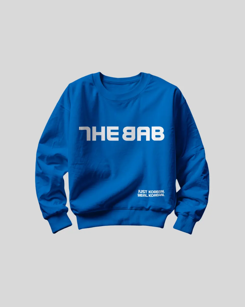
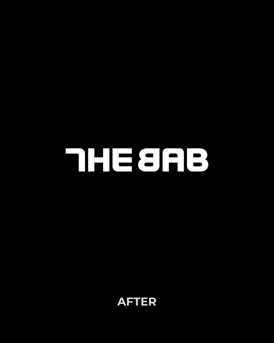
THE BAB
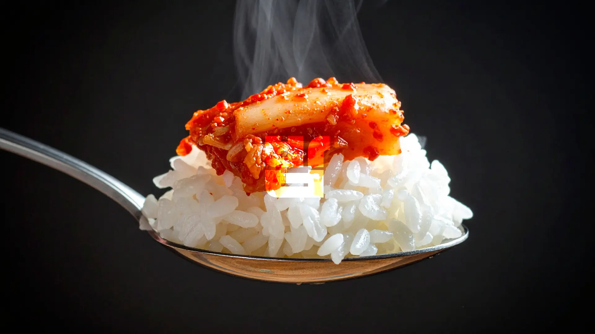
한국인에게 ‘밥(BAB)’은 단순한 음식 그 이상입니다. 우리 선조들은 쌀이 귀해, 밥 한 끼조차 먹기 어려웠던 시절을 겪었습니다. 그래서 “밥 먹었어?”라는 질문은 정말 상대가 식사를 했는지를 걱정하는 진심 어린 말이었습니다. 오늘날, 한국에서는 “식사하셨어요?” 또는 “밥 먹었어?”라는 말이 친근한 관계를 맺고 싶은 사람에게 안부를 건네는 따뜻하고 정감 있는 아주 흔한 인사말로 사용되고 있습니다.
그래서 '더밥'은 오늘도 당신에 묻습니다. ‘식사하셨어요?’
To Koreans, BAB(rice) is much more than just food. In the past, rice was scarce, and many people experienced times when even a single meal was hard to come by. That’s why the phrase “Have you eaten?” (Bab meogeosseoyo?) was once a heartfelt expression of concern, sincerely asking whether someone had managed to eat. Even today, Koreans still use greetings like “Have you eaten?” or “Did you have a meal?” as a warm, friendly way to express care and build connection, especially with someone they want to grow closer to.
And so, THE BAB gently asks you once again today: “Have you eaten?”
Brand Slogan
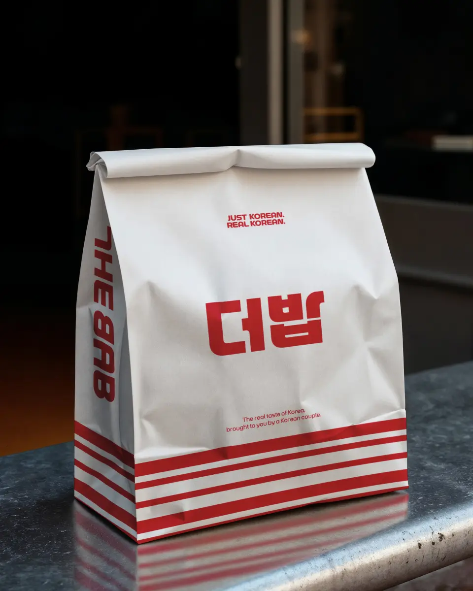
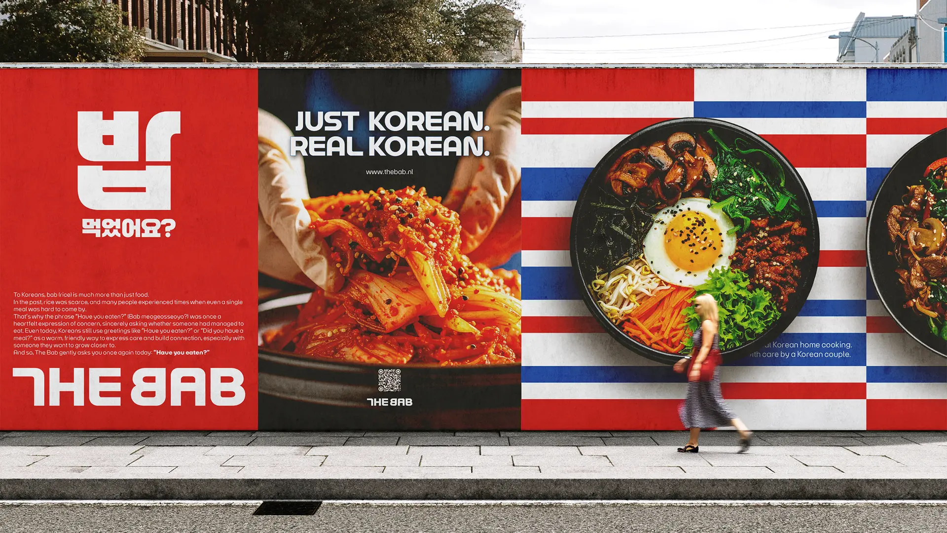
“Just Korean. Real Korean.”( 있는 그대로, 한국의 진짜 맛 )은 더밥의 브랜드 철학을 가장 명확하게 표현하는 슬로건입니다. 우리는 현지화에만 치우친 타협적인 방식이 아닌, 진짜 한국인들이 즐기는 한국 고유의 맛과 정신을 있는 그대로 전하는 정직한 로컬 한식 브랜드를 지향합니다. 더밥은 단순한 음식점이 아닌, 진정성 있는 K-푸드와 K-컬처의 본질을 유럽 현지에 온전히 전파하는 플랫폼으로서의 정체성을 구축하고 있습니다.
“Just Korean. Real Korean.” perfectly encapsulates the brand philosophy of The Bab. We do not pursue a diluted or overly localized approach, but instead strive to deliver the authentic flavors and spirit of Korean cuisine with honesty and integrity. The Bab is more than just a restaurant — it is a cultural platform dedicated to faithfully introducing the true essence of K-food and K-culture across Europe.
“Just Korean. Real Korean.” perfectly encapsulates the brand philosophy of The Bab. We do not pursue a diluted or overly localized approach, but instead strive to deliver the authentic flavors and spirit of Korean cuisine with honesty and integrity. The Bab is more than just a restaurant — it is a cultural platform dedicated to faithfully introducing the true essence of K-food and K-culture across Europe.
Brand Logo
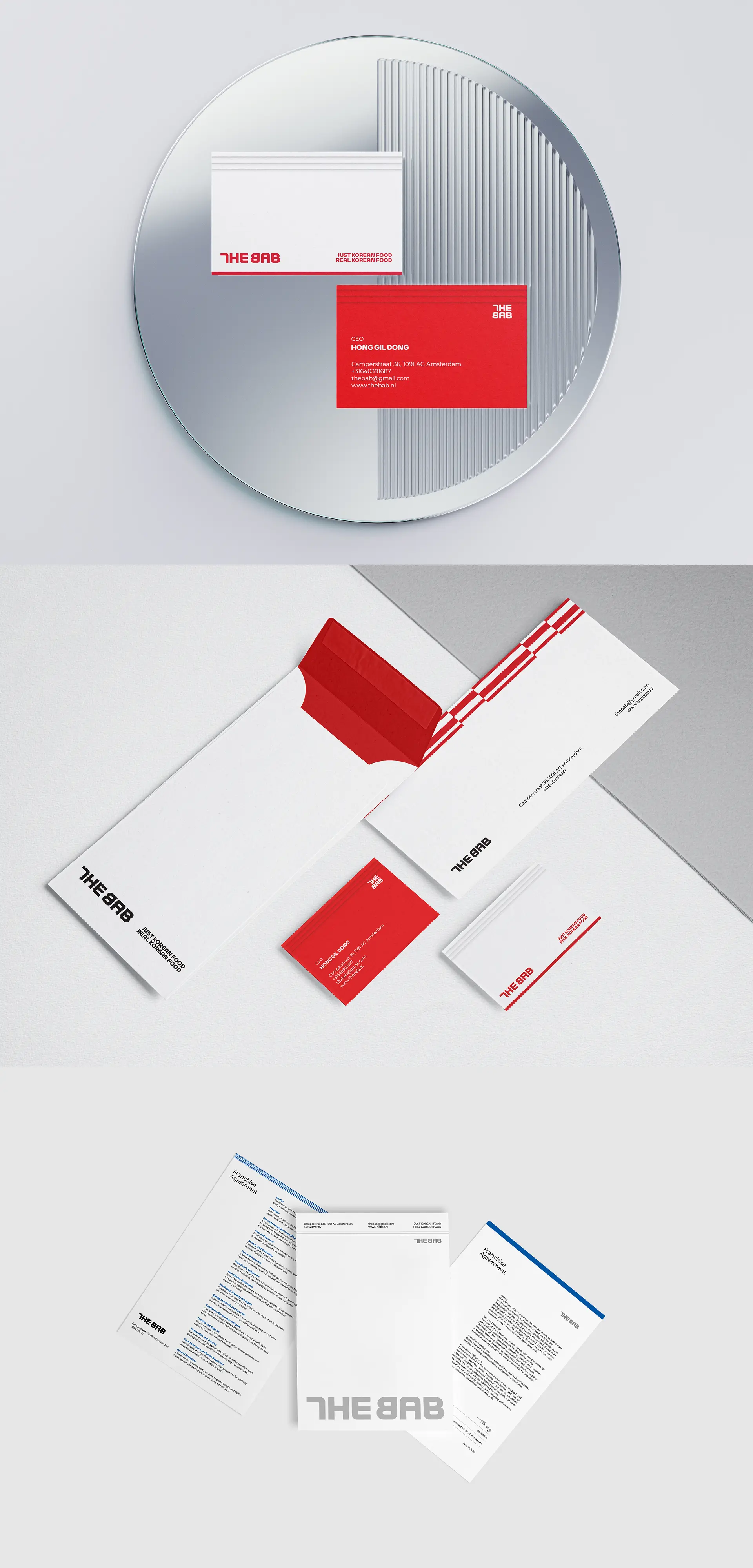
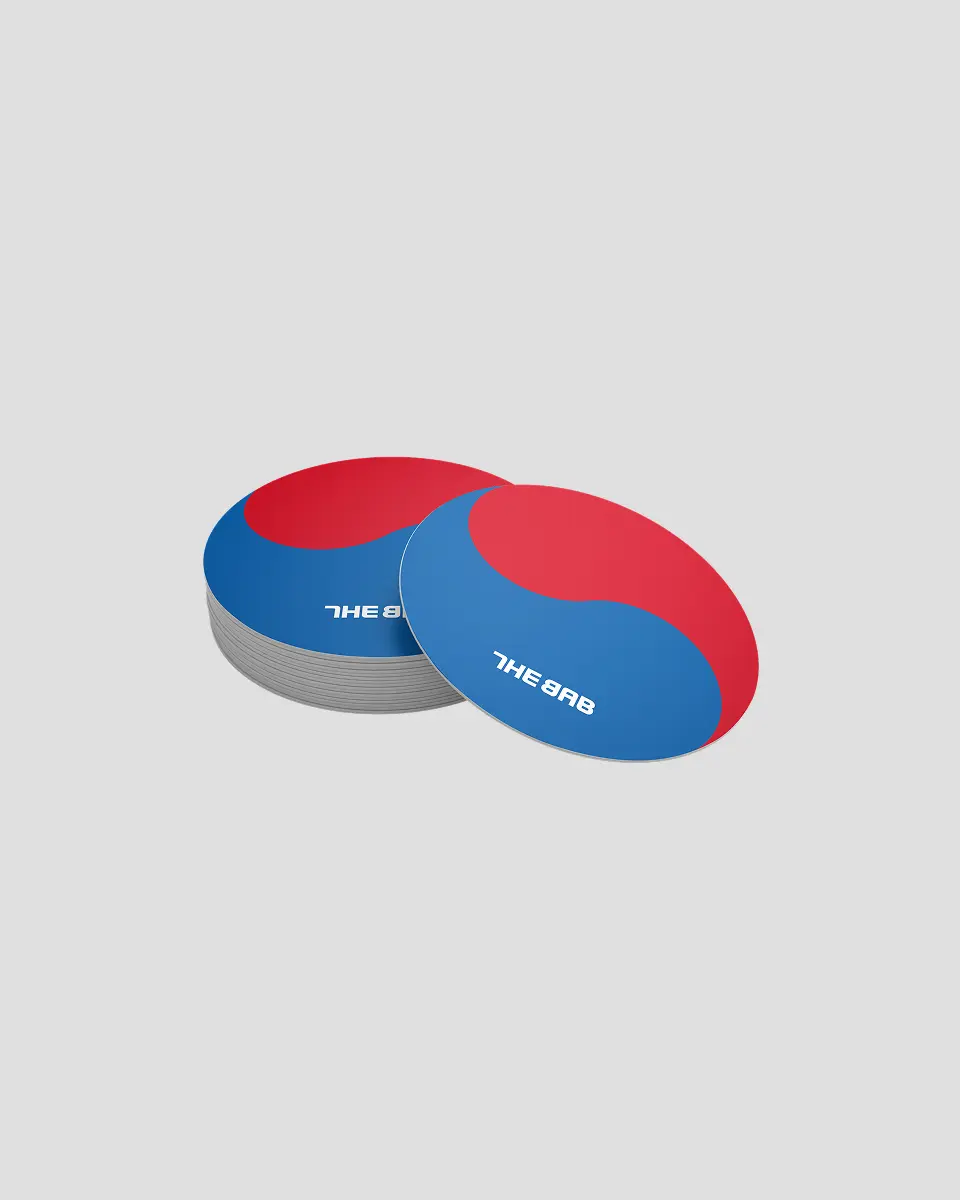
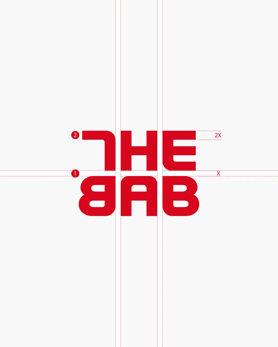
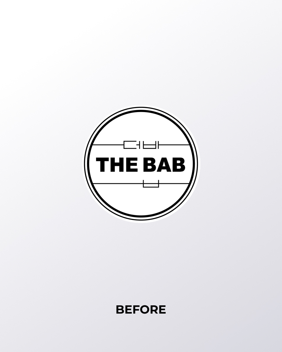
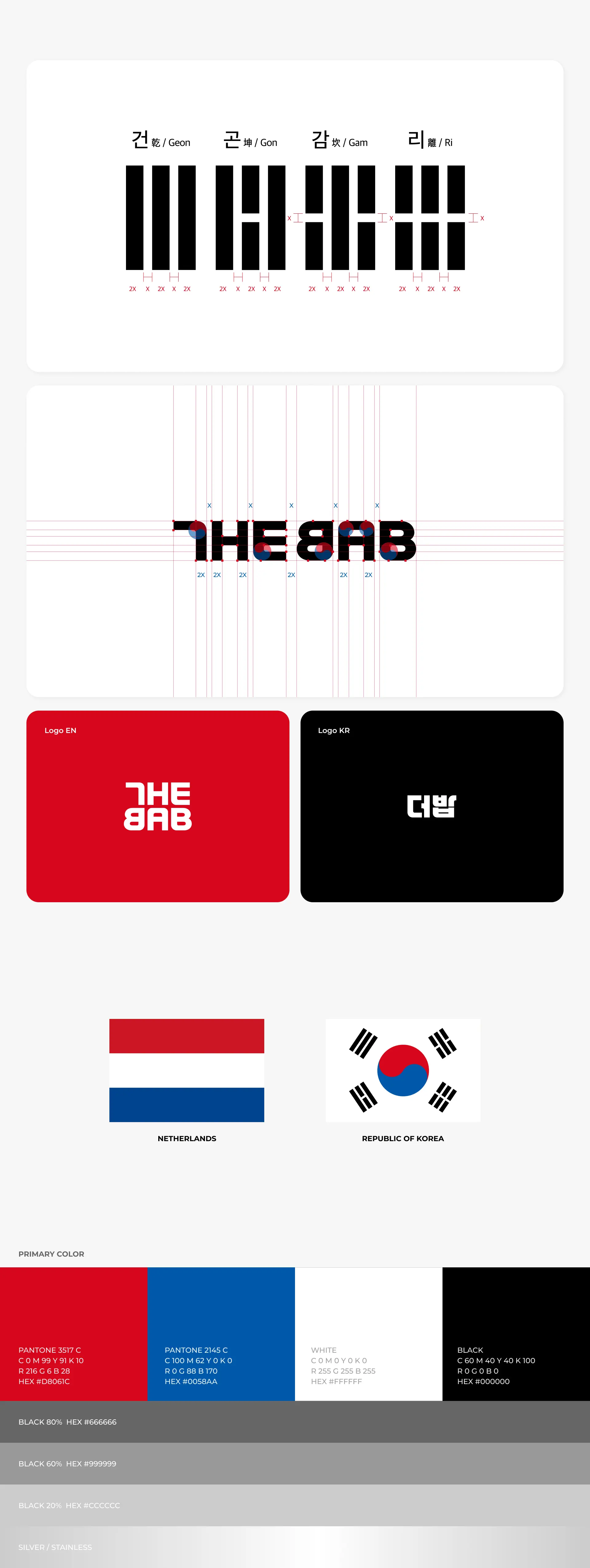
더밥(THE BAB)의 로고 디자인은 태극기의 건(乾), 곤(坤), 감(坎), 리(離) 4괘의 간격과 비례 체계를 기준으로 정밀하게 설계되었습니다. 워드마크형 로고는 브랜드 네이밍인 ‘THE BAB’(더밥)을 직관적으로 인식할 수 있도록 구성되었으며, 태극의 원형을 시각 요소로 활용하여, 한국인이 운영하는 한식당이라는 브랜드의 정체성을 강하게 전달합니다.
THE BAB’s logo is precisely designed based on the proportional system and spacing of the four trigrams—Geon (☰), Gon (☷), Gam (☵), and Ri (☲)—found on the South Korean national flag. As a wordmark, the logo allows for immediate recognition of the brand name ‘THE BAB’, while incorporating the circular form of the Taegeuk symbol as a visual element. This design clearly expresses the brand’s identity as a Korean-owned restaurant rooted in authentic local Korean food culture.
THE BAB’s logo is precisely designed based on the proportional system and spacing of the four trigrams—Geon (☰), Gon (☷), Gam (☵), and Ri (☲)—found on the South Korean national flag. As a wordmark, the logo allows for immediate recognition of the brand name ‘THE BAB’, while incorporating the circular form of the Taegeuk symbol as a visual element. This design clearly expresses the brand’s identity as a Korean-owned restaurant rooted in authentic local Korean food culture.
Brand color
더밥(THE BAB)의 브랜드 메인컬러는 레드(Red), 블루(Blue), 화이트(White), 블랙(Black)로 구성되어 있습니다. 이 중 세 가지 컬러는 대한민국과 네덜란드 양국의 국기에서 공통적으로 사용되는 색상으로, 더밥이 한국의 정체성을 기반으로 하여 네덜란드 현지에서 성장하고자 하는 브랜드 철학을 상징적으로 담고 있습니다. 이러한 컬러 선택은 단순한 시각적 조화를 넘어, 두 나라 간의 문화적 연결성과 상호 존중을 의미합니다. 특히 레드는 한국인의 열정과 온정, 블루는 신뢰와 깊은 한국의 전통, 화이트는 순수성과 정직함을 상징하며, 이는 ‘더밥’이 추구하는 진정성 있는 한식 문화의 소울푸드 전파와도 맞닿아 있습니다. 이 세 가지 메인 컬러를 통해, 한국의 로컬 문화와 가치를 현대적인 감각으로 재해석하고, 동시에 현지 소비자에게 친근하고 의미 있는 브랜드 경험을 제공하고자 합니다.
THE BAB’s brand color palette consists of red, blue, white, and black. Among these, red, blue, and white are colors shared by both the South Korean and Dutch national flags, symbolizing the brand’s core philosophy of growing Korean identity within the Dutch local context. This color choice goes beyond visual harmony—it reflects a sense of cultural connection and mutual respect between the two nations. Red stands for the warmth and passion of the Korean people, blue symbolizes trust and the depth of Korean heritage, and white represents purity and honesty. These values align with THE BAB’s mission to share authentic Korean soul food rooted in sincerity. Through this palette, THE BAB reinterprets Korean local culture and values with a modern touch, while offering European audiences a meaningful and approachable brand experience.
THE BAB’s brand color palette consists of red, blue, white, and black. Among these, red, blue, and white are colors shared by both the South Korean and Dutch national flags, symbolizing the brand’s core philosophy of growing Korean identity within the Dutch local context. This color choice goes beyond visual harmony—it reflects a sense of cultural connection and mutual respect between the two nations. Red stands for the warmth and passion of the Korean people, blue symbolizes trust and the depth of Korean heritage, and white represents purity and honesty. These values align with THE BAB’s mission to share authentic Korean soul food rooted in sincerity. Through this palette, THE BAB reinterprets Korean local culture and values with a modern touch, while offering European audiences a meaningful and approachable brand experience.
Brand strategy
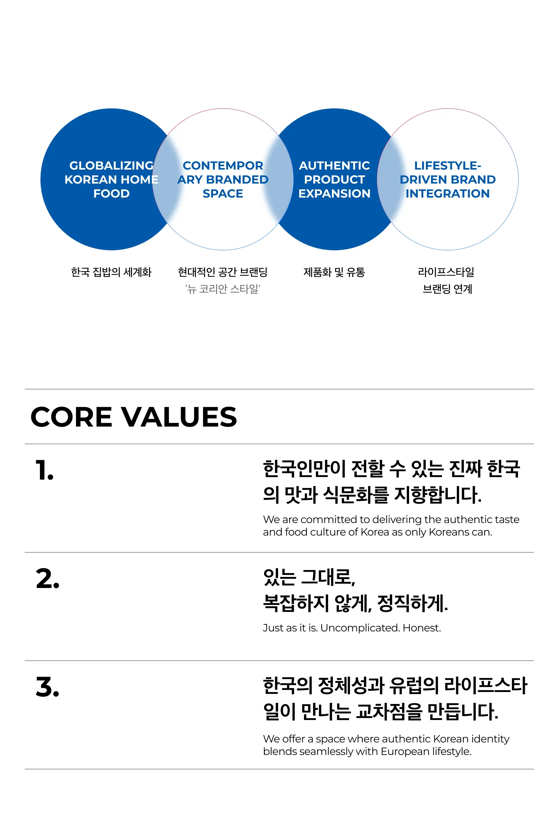
THE BAB은 ‘한국의 집밥’을 현대적인 감각으로 재해석한 글로벌 다이닝 브랜드로 성장하고자 합니다.
전통적인 한정식 레스토랑의 무거운 분위기에서 벗어나, 누구나 편하게 즐길 수 있는 ‘현대적이고 캐주얼한 한식 다이닝바’ 콘셉트를 중심으로 유럽전역 프랜차이즈 확장 계획에 있습니다. ‘뉴코리안 스타일’의 감각적인 외관과 내부 인테리어, 단순하고 직관적인 메뉴 구성, 그리고 정서적 가치를 담은 ‘한 끼의 따뜻함’이라는 철학을 결합한 진짜 한국의 집밥을 즐길 수 있는 다양한 브랜드 경험을 제시합니다.
THE BAB aims to grow into a global dining brand that reinterprets traditional Korean home-cooked meals with a modern and accessible touch. Departing from the formal and heavy atmosphere of traditional Korean fine dining, THE BAB is expanding across Europe with a concept centered on a contemporary, casual Korean dining bar. With a 'New Korean Style' approach, THE BAB offers a stylish exterior and interior design, a straightforward and intuitive menu, and a brand philosophy rooted in the emotional warmth of a single meal. Through this, we deliver an authentic Korean home-cooked dining experience that resonates with today’s global audience.
KEY VISUAL
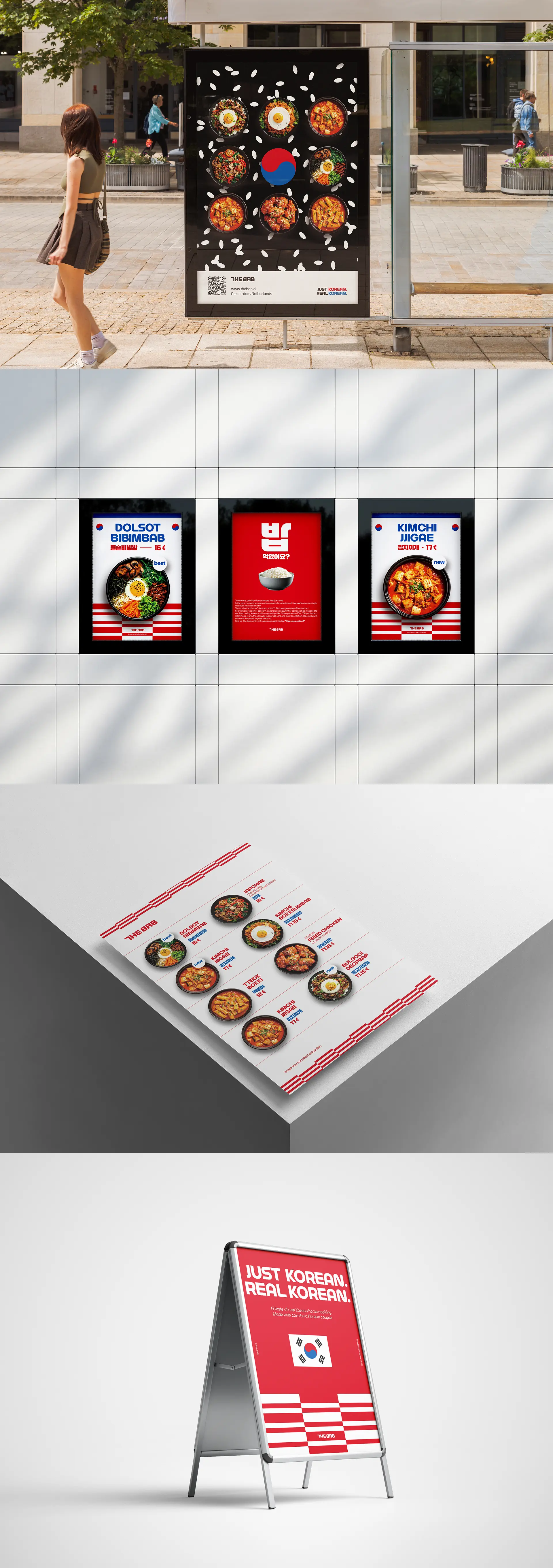
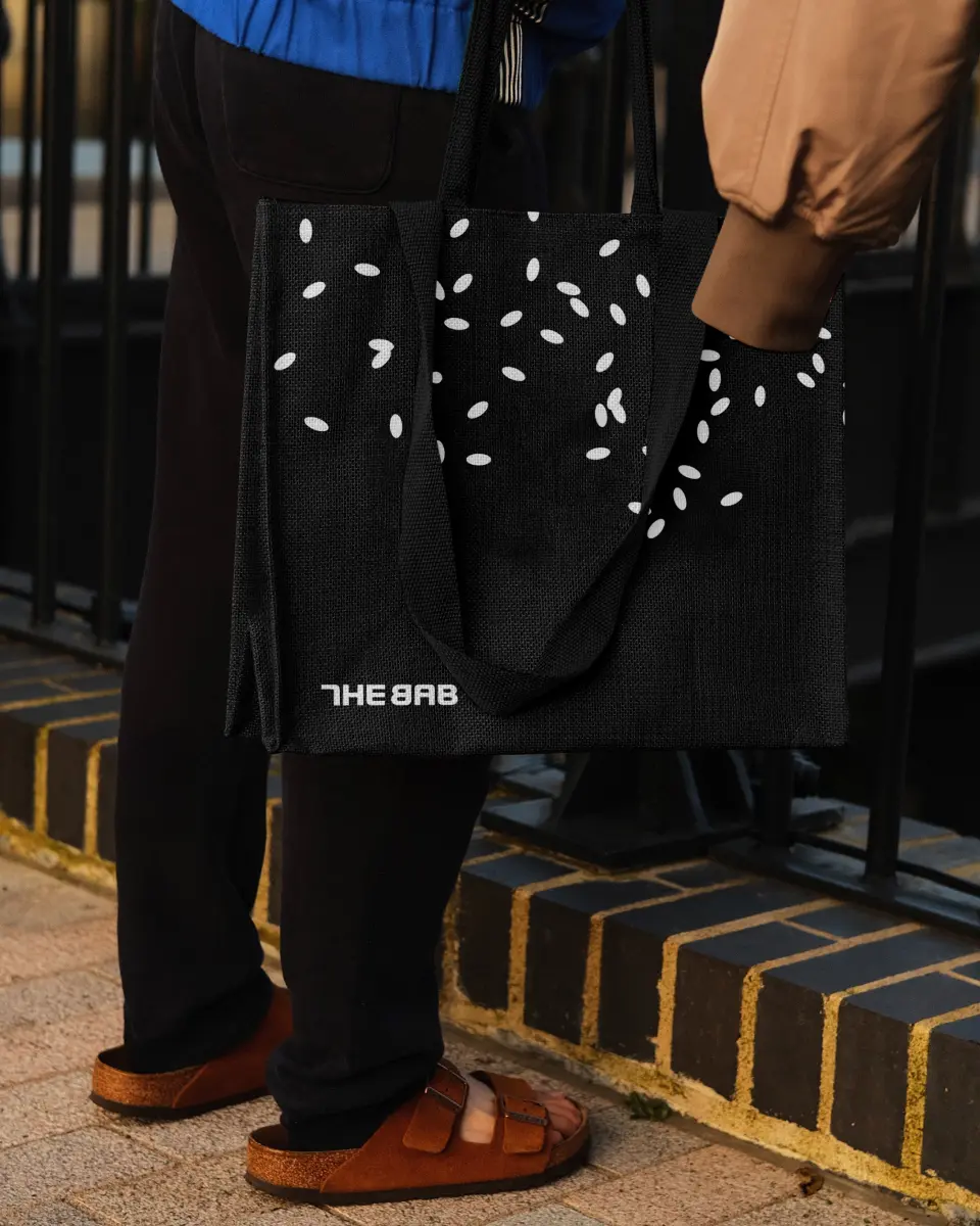
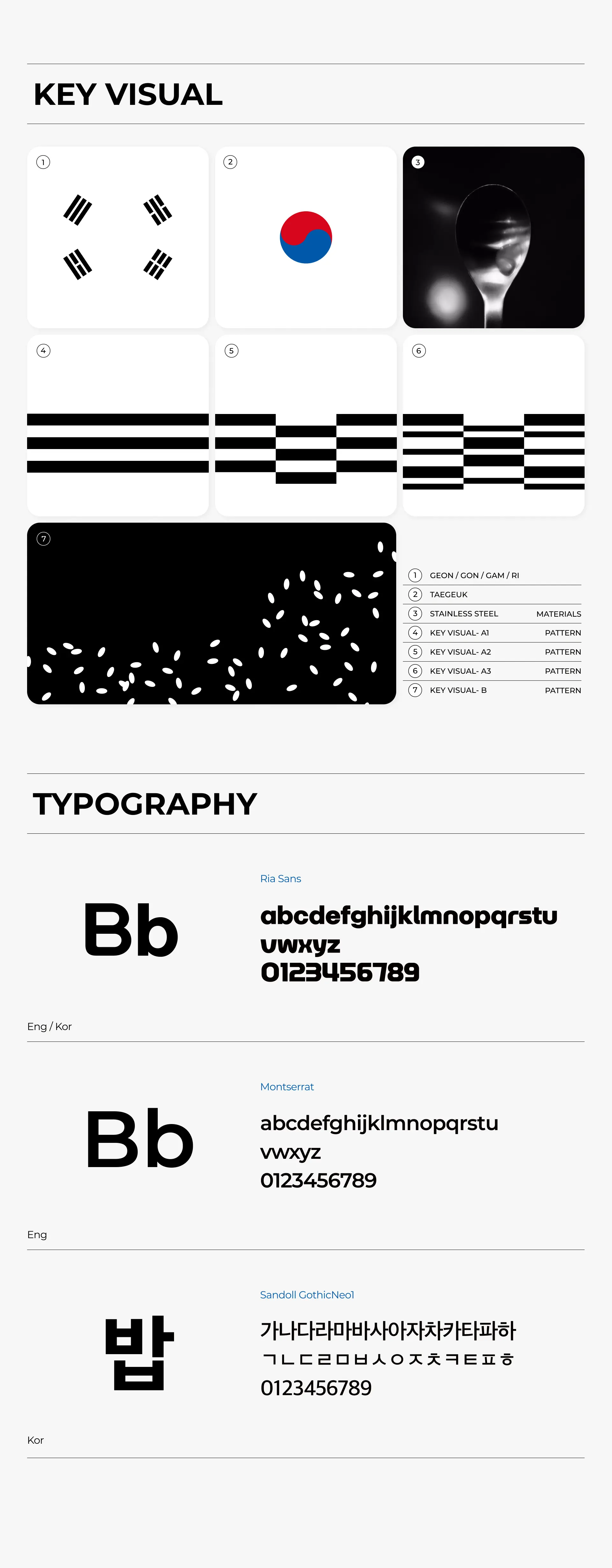
키비주얼(Key Visual)은 브랜드가 사용자와 만나는 다양한 접점에서 브랜드 아이덴티티를 가장 강력하게 전달하는 디자인 요소입니다. ‘THE BAB’의 키비주얼은 밥의 원재료인 ‘쌀’의 형태를 단순화하여 시각화하고, 로고에 사용된 태극기의 건곤감리(乾坤坎離) 요소를 패턴화하여 적용함으로써, 대한민국 한식의 생동감과 정체성을 직관적으로 느낄 수 있도록 디자인되었습니다.
A key visual is one of the most powerful design elements used to communicate a brand’s identity at every point of contact with the audience. The key visual of THE BAB simplifies and visualizes the shape of rice — the essential ingredient of bab (cooked rice) and incorporates patterns inspired by the traditional Korean Geon-Gon-Gam-Ri symbols from the national flag. This design approach allows viewers to intuitively feel the vibrancy and authenticity of Korean cuisine.
A key visual is one of the most powerful design elements used to communicate a brand’s identity at every point of contact with the audience. The key visual of THE BAB simplifies and visualizes the shape of rice — the essential ingredient of bab (cooked rice) and incorporates patterns inspired by the traditional Korean Geon-Gon-Gam-Ri symbols from the national flag. This design approach allows viewers to intuitively feel the vibrancy and authenticity of Korean cuisine.

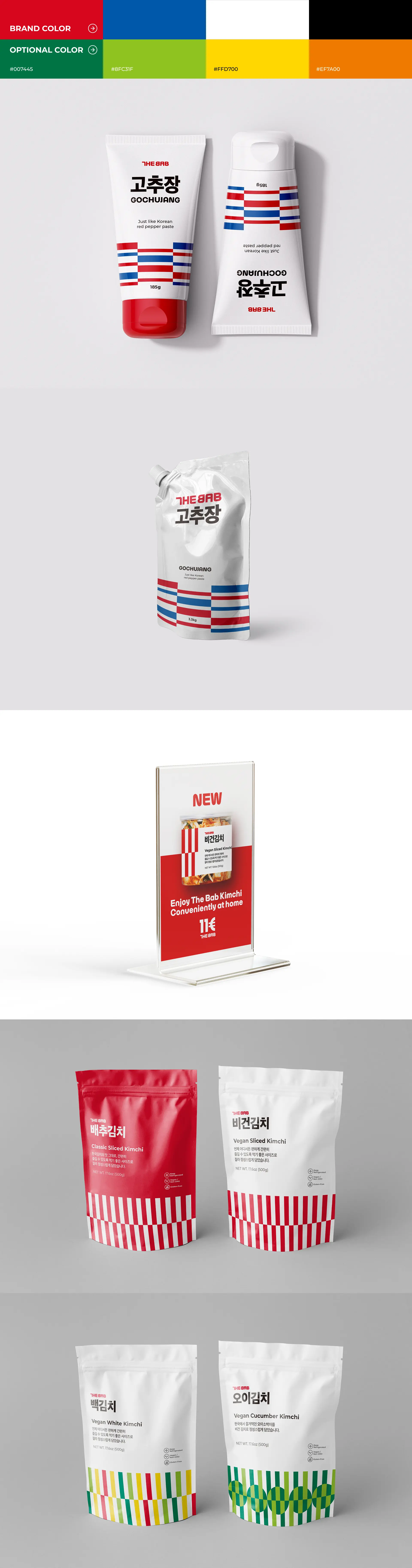
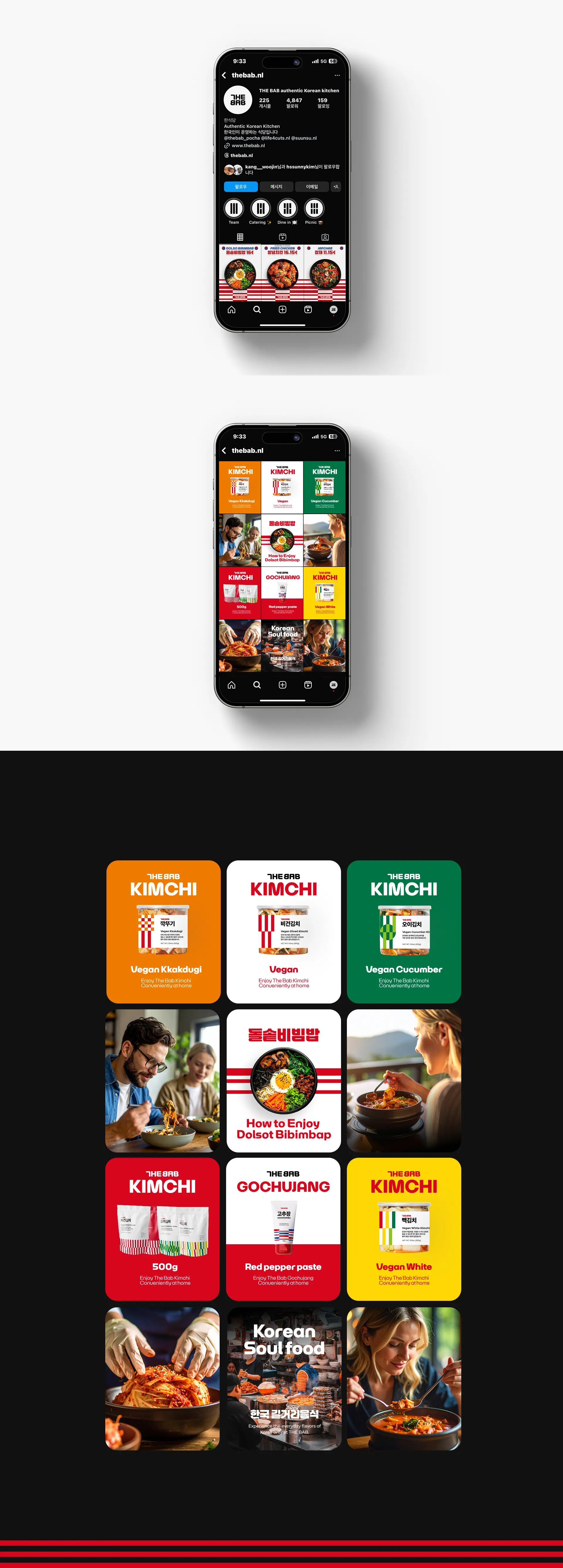
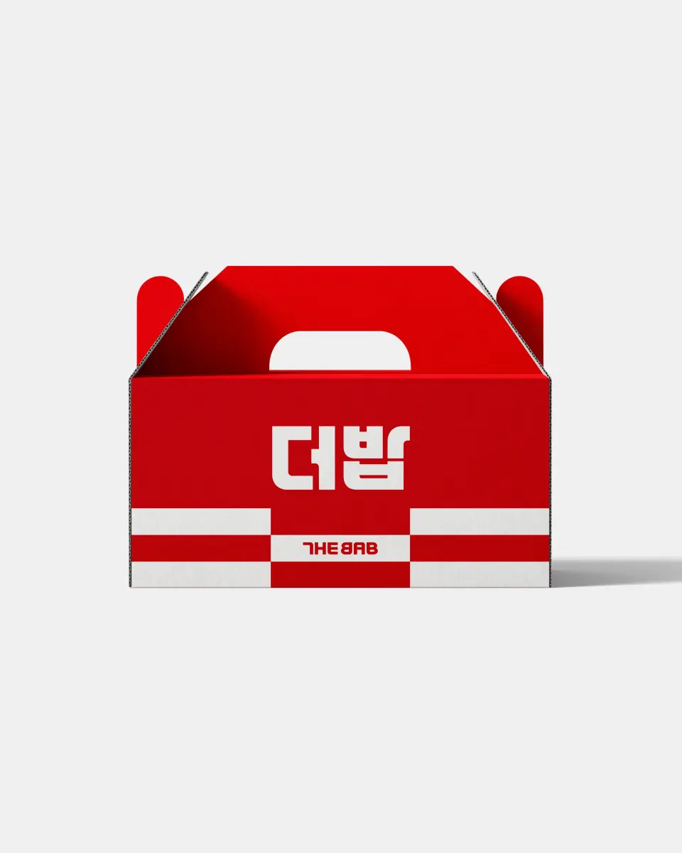
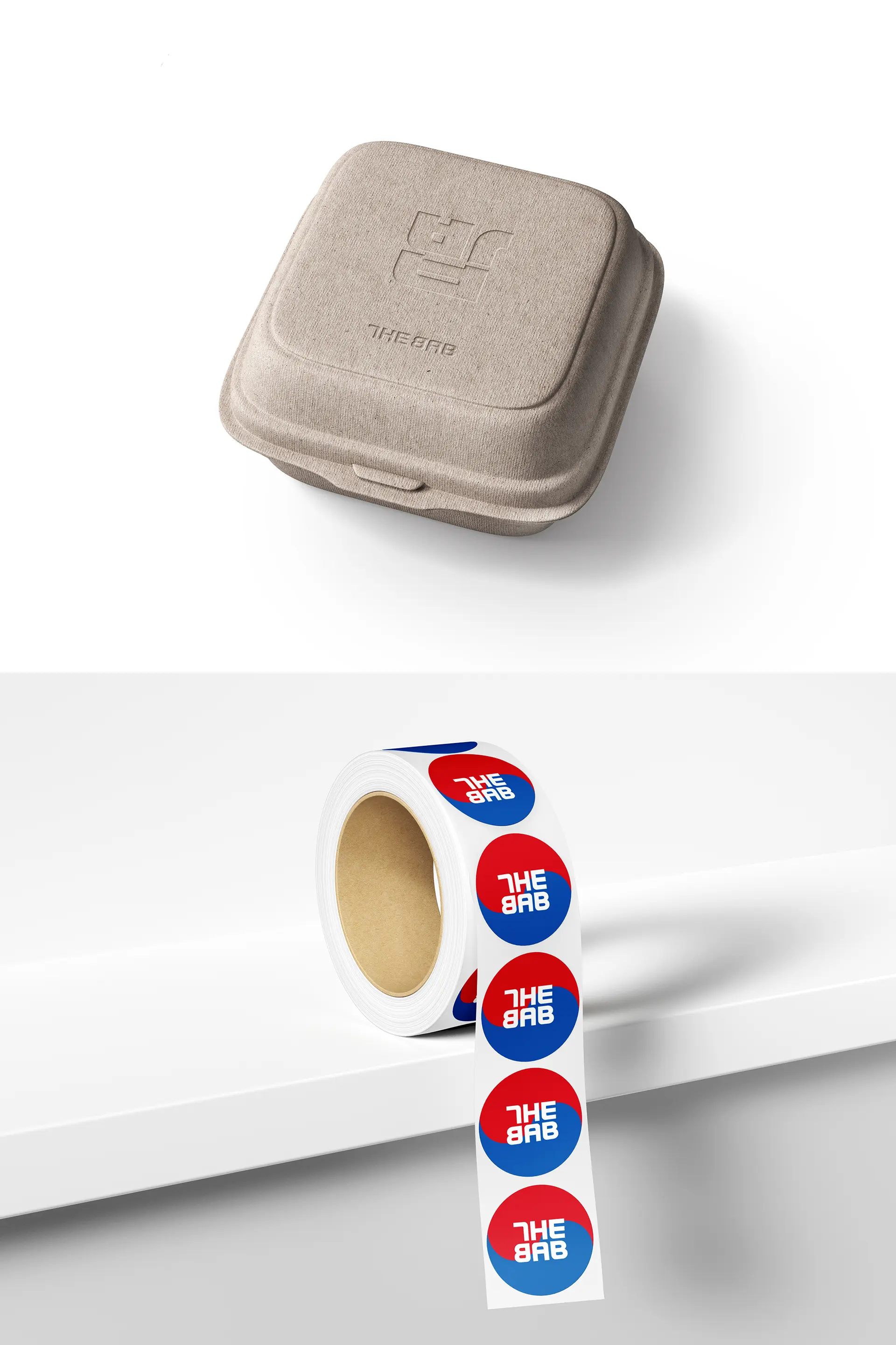
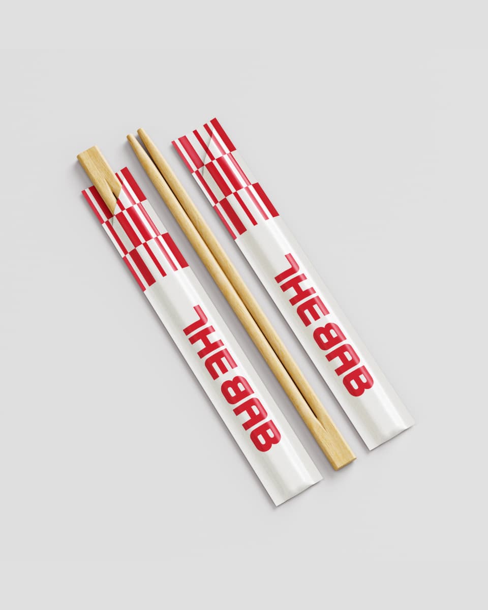
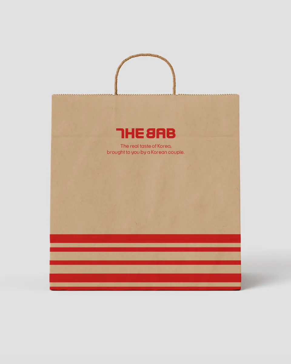
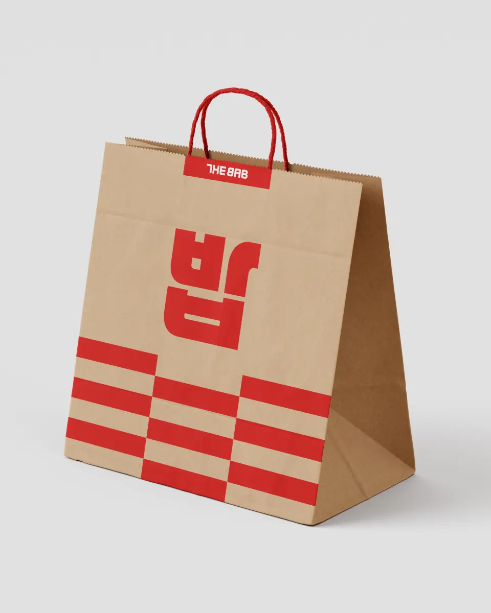
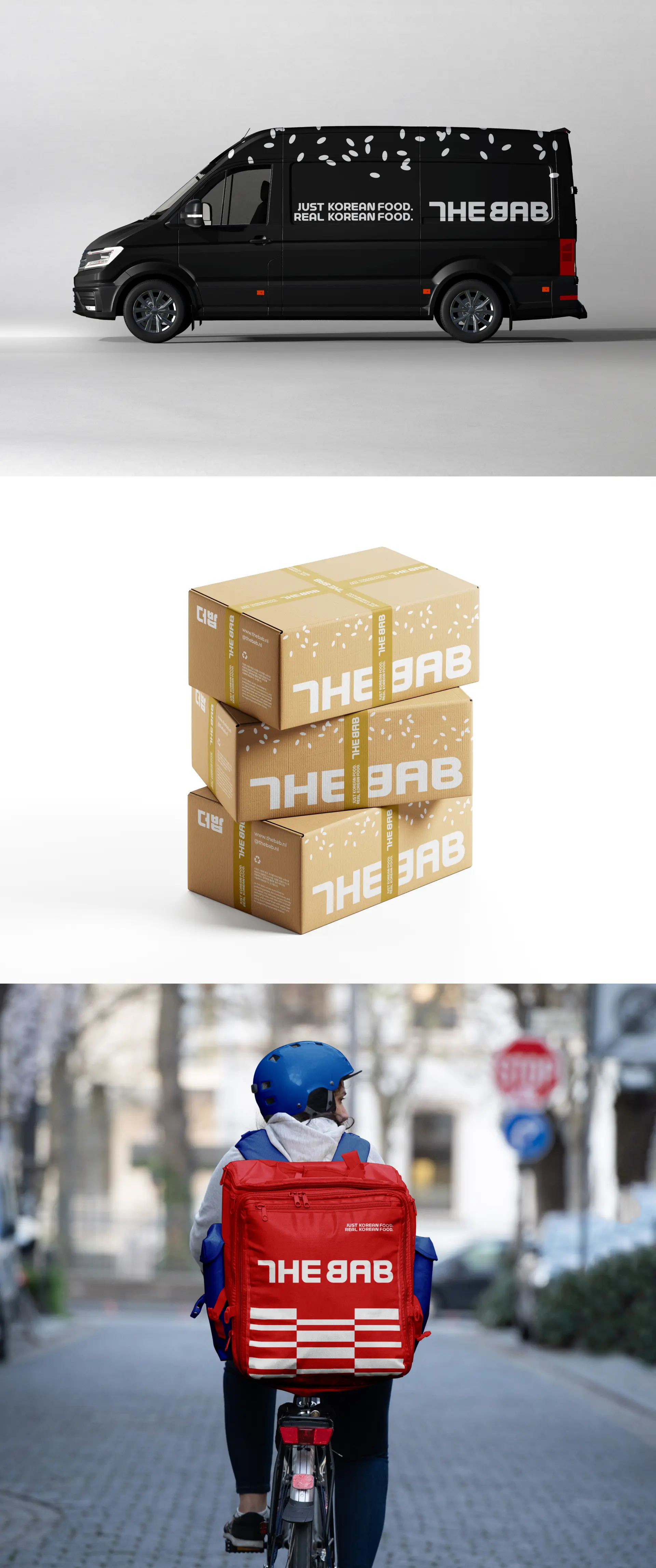
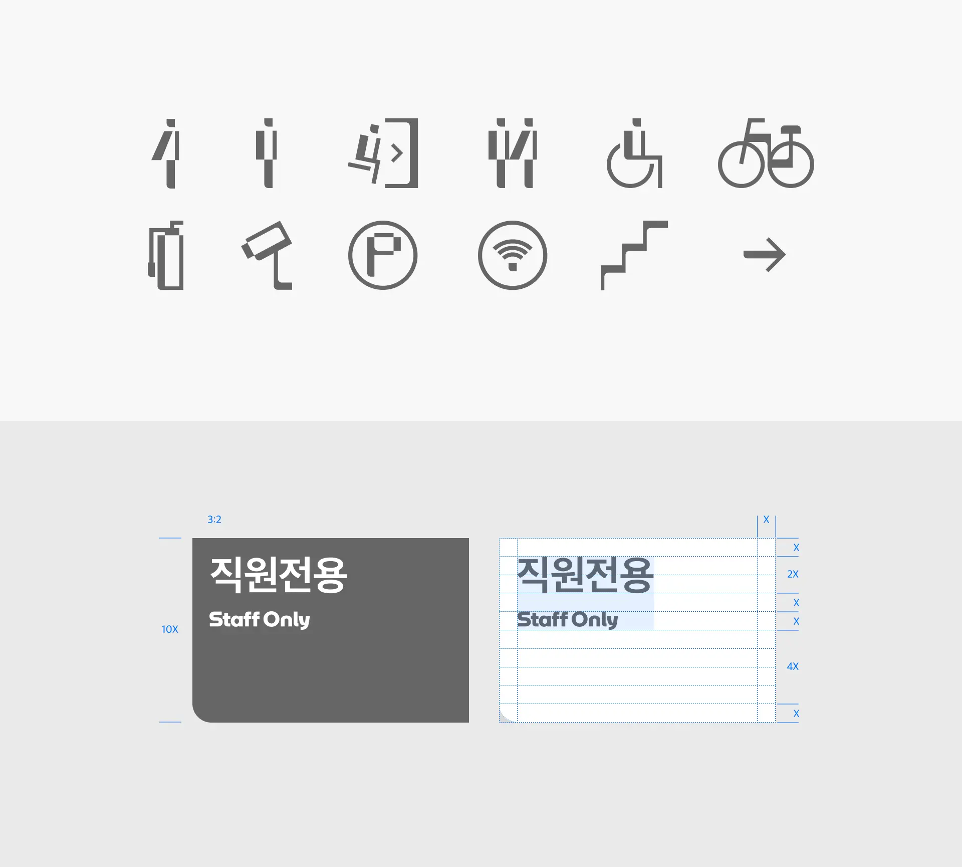
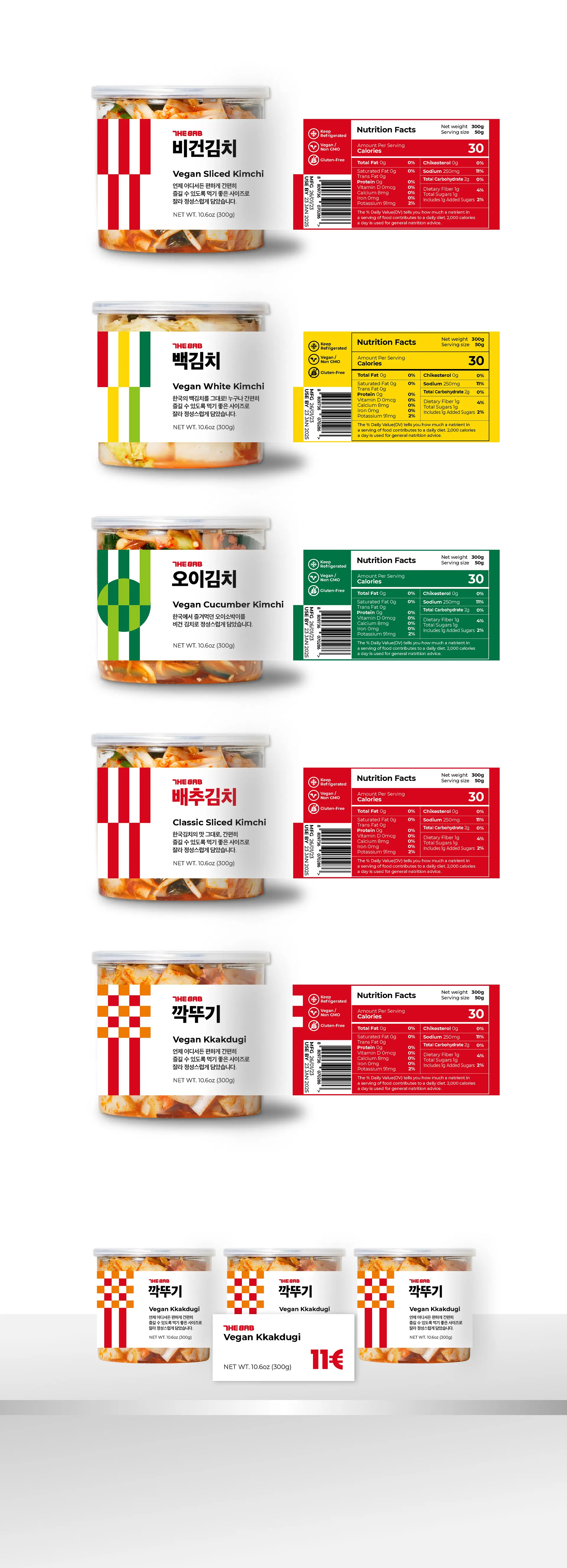
THE BAB의 패키지 라인업은 브랜드 아이덴티티(BI)의 키 비주얼을 기반으로 확장된 디자인 시스템으로 구성됩니다. 제품 패키지에 적용되는 라인 아이콘은 미니멀하고 정제된 스타일로, 각 제품의 특징 및 USP(Unique Selling Point)를 직관적으로 전달하며, 다양한 패키지 요소들과도 시각적으로 유기적인 조화를 이룹니다. 특히 THE BAB의 BI 핵심 요소인 태극기의 건(乾), 곤(坤), 감(坎), 리(離) 사괘를 그래픽적으로 변형·응용하여, 개별 제품 라인의 정체성을 유지함과 동시에 전체 브랜드의 통일성과 신뢰도를 강화하는 보증 장치로 기능합니다. 이러한 접근은 단순한 디자인 적용을 넘어, THE BAB의 철학과 정체성을 패키지 영역까지 일관성 있게 확장하며, 브랜드 아이덴티티의 지속 가능한 구축에 기여합니다.
THE BAB’s packaging line is an extended design system derived from its core brand identity (BI) and key visual language.
Each product package features refined, minimalist line icons that intuitively communicate the product’s unique characteristics and USP (Unique Selling Proposition), while maintaining visual harmony across all packaging elements. A central design element of THE BAB’s BI is the reinterpretation of the four trigrams from the Korean national flag — Geon (☰), Gon (☷), Gam (☵), and Ri (☲). These symbols are graphically adapted and applied to each product line, enabling both a distinct identity for individual items and a consistent, trustworthy visual language across the entire brand system. This approach goes beyond surface-level aesthetics. It strategically reinforces THE BAB’s philosophy and identity throughout the packaging experience, contributing to a cohesive and sustainable brand presence.
Optional Color
THE BAB의 옵셔널 컬러 팔레트는 브랜드 아이덴티티(BI)의 확장 요소로서, 제품 라인업별 특성과 시즌별 캠페인에 유연하게 적용될 수 있도록 구성되었습니다. 이 컬러들은 키비주얼과의 조화로운 결합을 통해 BI의 일관성을 유지하며, 브랜드 경험 전반에 통일된 인상을 전달합니다. 특히, 옵셔널 컬러는 전통 한식에서 자주 사용되는 대표 재료들의 색에서 영감을 받아 선정되었으며, 이를 통해 한국 음식 고유의 시각적 정서를 효과적으로 반영하고 있습니다.
The optional color palette of THE BAB serves as an extension of the brand identity (BI), offering flexible application across different product lines and seasonal campaigns. These colors are thoughtfully designed to work in harmony with the key visual elements, ensuring a consistent and cohesive brand image across all touchpoints. Inspired by the natural hues of traditional Korean ingredients, the optional palette reflects the visual and cultural essence of Korean cuisine, further reinforcing the brand’s authenticity and emotional resonance.
The optional color palette of THE BAB serves as an extension of the brand identity (BI), offering flexible application across different product lines and seasonal campaigns. These colors are thoughtfully designed to work in harmony with the key visual elements, ensuring a consistent and cohesive brand image across all touchpoints. Inspired by the natural hues of traditional Korean ingredients, the optional palette reflects the visual and cultural essence of Korean cuisine, further reinforcing the brand’s authenticity and emotional resonance.